Cloud BPA Overview
The SP360 Cloud BPA Dashboard provides information about both the current state and historical trending of Cloud Best Practice Assessment (BPA) Findings. It enables you to understand how the number of Findings changes over time and to review current Findings by severity, status, Control, and Control Group.
The dashboard displays data through various charts that can be filtered and tailored using the options at the top of the page.
Filtering Chart Content
For ease of use, the dashboard has options/buttons at the top of the page that can be used to filter or modify the chart information.

| Options/Buttons | Descriptions |
|---|---|
| Severity | From this multi-select drop-down you can select one or more severities of interest to alter the data shown in the charts accordingly. The severity of each Finding is classified as Critical, High, Medium, or Low. |
| Cloud Provider | Currently only AWS is supported, and this button is provided more for documentation. In the future, when additional environments are supported (i.e., Microsoft Azure, Google Cloud Platform (GCP), Microsoft 365 (M365)) clicking the Cloud Provider button enables you can filter the available information to Findings associated with that provider. For example, selecting AWS limits the charts to Findings associated with AWS . |
| Duration | Using this control, you can establish the time period the trending charts cover. The available options are 4 weeks, 3 months, 6 months, or 1 year. |
| Interval | Using this control, you can establish the period of time each data point represents. The available intervals are 1 week, 4 weeks, 3 months, or 6 months. This option allows you to view trending over the desired time periods. |
 | Clicking the eye icon displays the Finding counts for each interval directly on the trending charts, removing the need to hover over individual data points. |
The enhanced Cloud BPA Dashboard provides information in three primary sections:
- Findings Trending History
- Current Findings
- Cloud BPA Integrations
Findings Trending History
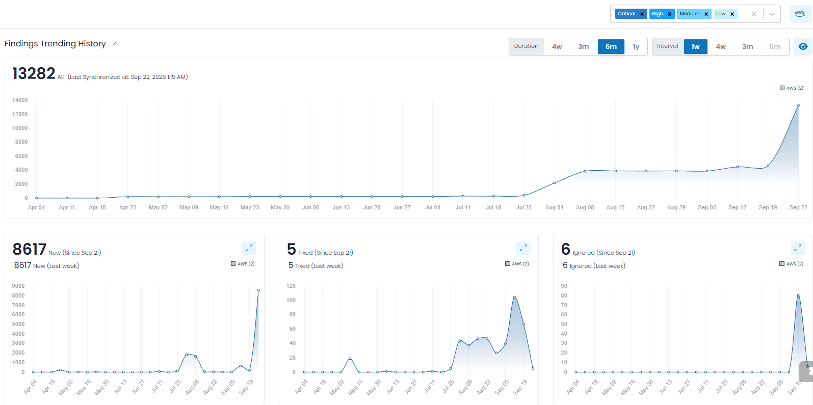
The Findings Trending History, which is a collapsible section, provides an overall trending of Finding counts so that you can observe how Findings change over time.
The data in the charts is filtered according to the options selected at the top of the dashboard and are segmented into separate charts for:
- Total Number of Findings
- New Findings
- Fixed Findings
- Ignored Findings
This follows the same general historical-trending approach used elsewhere in SP360, where separate charts distinguish total, newly identified, remediated, and ignored items.
Total Number of Findings
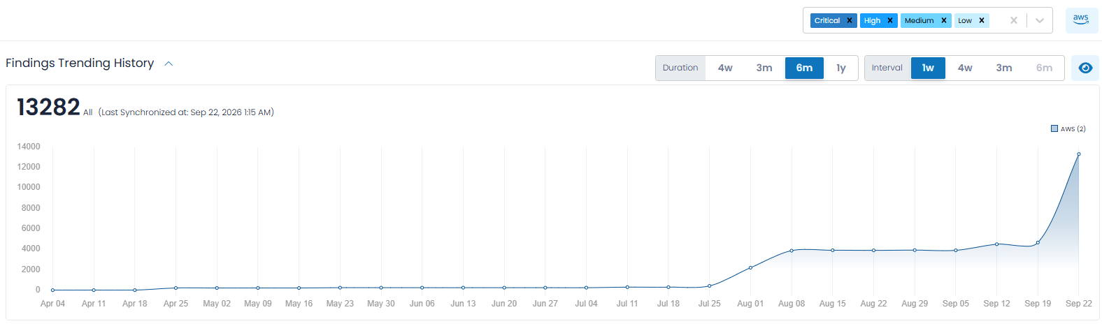
This chart shows the historical trending of the total number of Findings over the selected Duration and is filtered according to the controls discussed above. Often organizations will be most interested in the highest severity findings and will limit the charts to Critical findings.
The number displayed in the upper-left corner of each graph represents the latest Finding count based on the selected filters. The Last Synchronized notation shows when the displayed information was most recently synchronized.
Each data point represents the Finding count for the selected Interval. For example, selecting a 6-month Duration and a 1-week Interval shows the Finding count at weekly intervals throughout the previous six months.
New Findings
This chart provides insight into new Findings, meaning Findings that were discovered for the first time within the most recent selected Interval.
For example, if you choose an Interval of one week, the chart shows how many new Findings were identified during each complete week throughout the selected Duration.
Two annotations are displayed above the chart. The upper annotation shows the number of new Findings identified since the beginning of the current, incomplete Interval. The lower annotation shows the number of new Findings identified during the last complete Interval.
Fixed Findings
This chart provides insight into Findings that were Fixed during each selected Interval.
This information allows you to understand the volume of Findings being remediated over time and to compare remediation activity across different periods.
As with New Findings, the upper annotation represents Findings fixed during the current partial Interval, while the lower annotation represents Findings fixed during the last complete Interval.
Ignored Findings
This chart provides insight into Findings that were moved to an Ignored status during each selected Interval.
This allows you to understand how many Findings are being intentionally excluded from active remediation and how that activity changes over time.
The upper annotation represents Findings ignored during the current partial Interval, while the lower annotation represents Findings ignored during the last complete Interval.
The  icon in the upper-right corner of the New, Fixed, and Ignored charts can be used to enlarge the applicable chart.
Current Findings
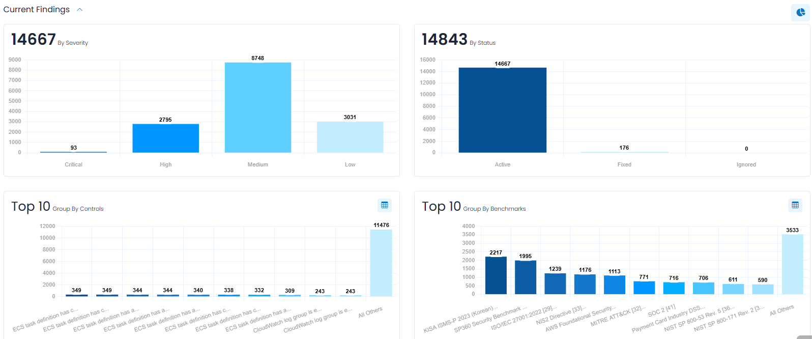
Current Findings, which is a collapsible section, provides charts showing the current Finding counts in the following categories:
- By Severity - allows you to quickly focus on the most severe Active Findings. Findings are grouped as Critical, High, Medium, or Low. The total shown in the upper-left corner represents the total number of Active Findings included in the chart.
- By Status - allows you to easily discern the current status of Findings by grouping them as Active, Fixed, or Ignored. The total shown in the upper-left corner represents the total number of Findings included in the chart.
- Top 10 (Group by Controls) - shows your Findings grouped by Control, allowing you to identify the Controls generating the largest number of Findings. Since a Control represents an individual item tested during a Cloud BPA scan, this view can help identify common issues that are generating multiple Findings. Findings associated with Controls outside the Top 10 are combined into All Others.
- Top 10 (Group by Benchmarks) - shows your Findings grouped by Benchmark and allows you to identify the Benchmarks associated with the largest number of Findings. Findings associated with Benchmarks outside the Top 10 are combined into All Others. Benchmarks are logical groupings of Controls that focus on a specific area (e.g., AWS S3 storage).
By default, these charts show counts and are represented as bar charts. If you prefer to see the counts expressed as percentages and in a pie chart format, that representation can be toggled utilizing the  icon in the upper-right corner of the section. Clicking the corresponding bar-chart icon returns the charts to the default count-based format.
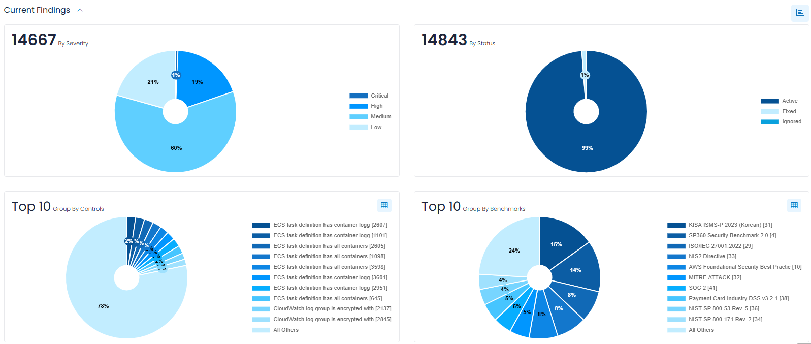
The two Top 10 grouping charts provide additional insight into where Findings are concentrated. Group By Controls provides a more granular view by individual Control, while Group By Benchmarks shows how Findings are distributed across the Benchmarks represented in the current data. Both charts also include a table icon in the upper-right corner for accessing additional information associated with the displayed groups.
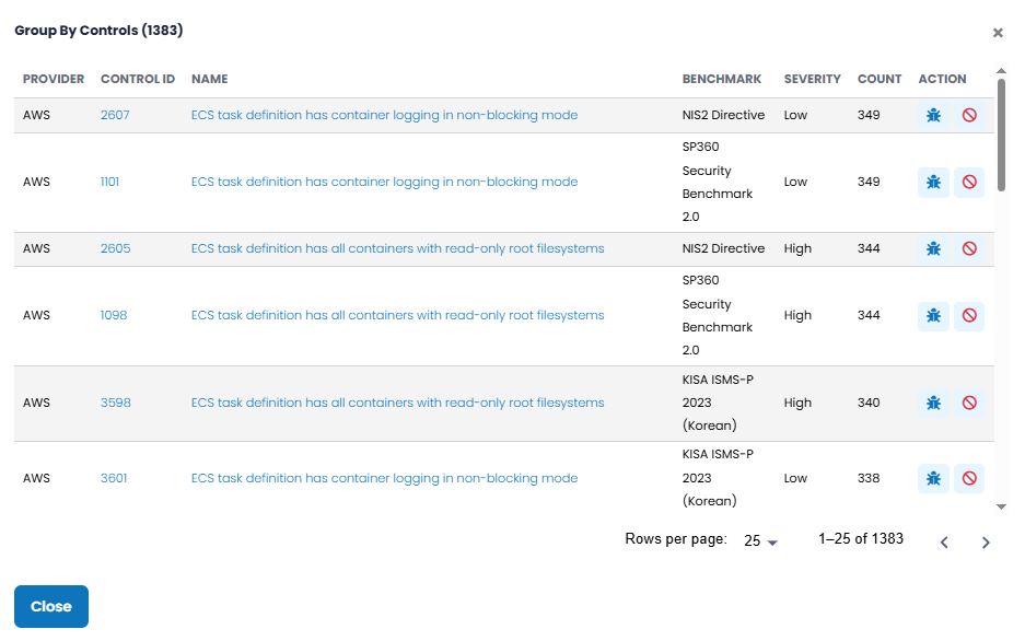
By clicking the  icon in the upper-right corner of those charts, you can view a pop-up (shown below ) that lists all groups (not just the Top 10) and provides additional information, as well as the ability to apply bulk functions, such as ignoring all the findings in that group. The action icon
  allows you to see each finding in the group, whereas
  allows multiple findings to be ignored more conveniently with a single request.
Cloud BPA Integrations
This sub-section of the dashboard allows users to view and manage the cloud integrations used for Best Practice Assessment and to tailor the BPA information being displayed by selecting specific integrations.
Clicking the  icon in the upper-right corner of the Integrations sub-section expands a drop-down menu containing tiles for the available Cloud Provider and Module combinations (as shown below). Users can select the appropriate tile to begin configuring a new integration.
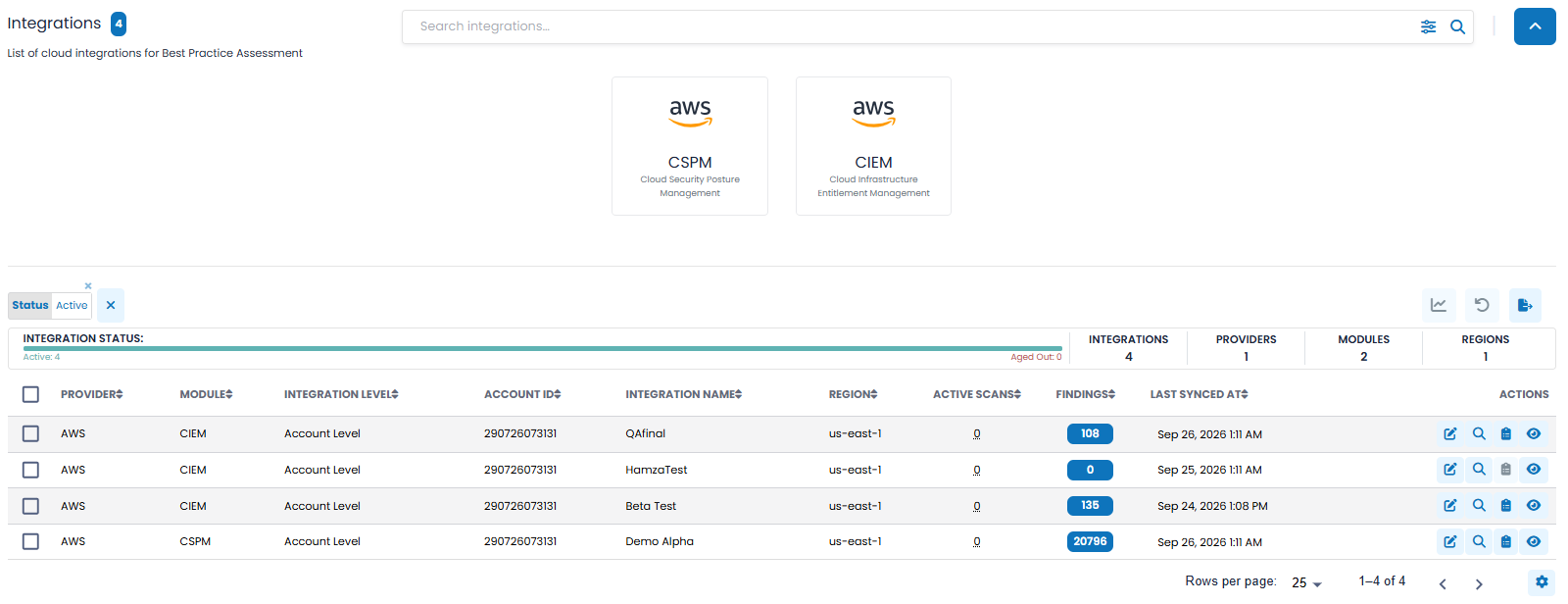
The currently supported configured integrations are represented by tiles identifying the Cloud Provider and Module, such as AWS CSPM (i.e., Cloud Security Posture Management) and AWS CIEM (i.e., Cloud Infrastructure Entitlement Management). In the near future , SP360 plans to support additional cloud providers, such as Microsoft Azure, Google Cloud Platform (GCP), and Microsoft 365 (M365), which will be represented as additional tiles in this sub-section.
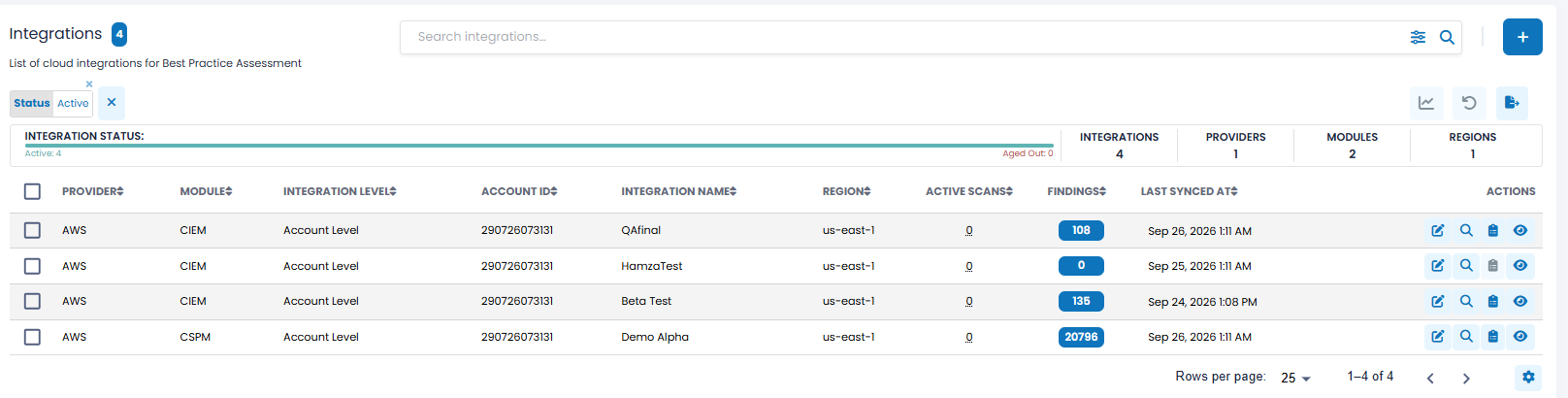
The upper left corner of the Integrations section contains a blue box with the number of integrations meeting your current selection criteria.
Filtering Options, Action Icons, and Insights Bar
The Integrations section includes a Search Integrations bar, filtering options, action icons, and an Insights Bar (all explained below).
Filtering Options
The Search and Filter bar allows you to search for integrations and filter the list based on the following attributes.
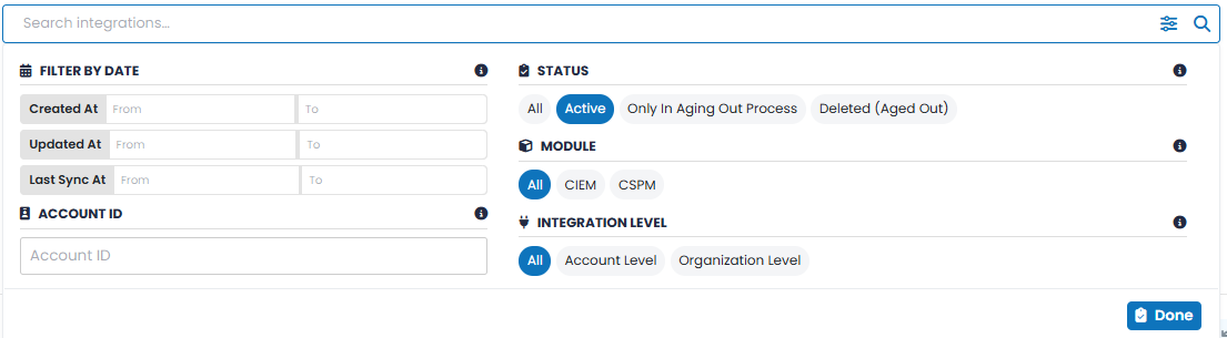
| Filter Type | Description |
|---|---|
| Filter by Date |
Allows you to filter integrations using a From and To date range. Available date filters include Created At, Updated At, and Last Sync At. |
| Account ID |
Allows you to filter integrations by the Cloud Provider Account ID associated with the integration. |
| Status |
Allows you to filter integrations based on their current status. Available options include All, Active, Only in Aging Out Process, and Deleted (Aged Out). |
| Benchmark |
Allows you to filter integrations according to the BPA Module being used. Available options include All, CIEM, and CSPM. |
| Integration Level |
Allows you to filter integrations according to how they are configured. Available options include All, Account Level, and Organization Level. |
Action Icons (Bulk Operations)
The checkboxes on the far left of each integration row allow you to select one or more integrations and apply bulk operations.
| Action Icons | Function |
|---|---|

|
Clicking this icon restricts the dashboard to showing only those integrations selected. This allows you to focus the Cloud BPA dashboard, charts, and Finding information on the selected cloud integrations. |

|
Clicking on this icon results in resetting the dashboard to its default state.
The reset icon includes an annotation
( |

|
Clicking this icon downloads, in CSV format, the integration data for all or selected integrations. |
 )
that indicates how many rows have been selected and will be reset, providing clearer context before the action is performed.
)
that indicates how many rows have been selected and will be reset, providing clearer context before the action is performed.
Note:
-
You can select the checkboxes on the far left to filter the data to display only integrations you are interested in. As the boxes are checked, a “Selected” counter appears and is updated, and the graph icon
becomes active. The dashboard will not reflect the changes until the graph icon is clicked.
-
Selections are retained across page scrolls, ensuring that any integrations you select remain checked as you navigate through the list. To return to the default state, click the
icon.
Integrations Insights Bar
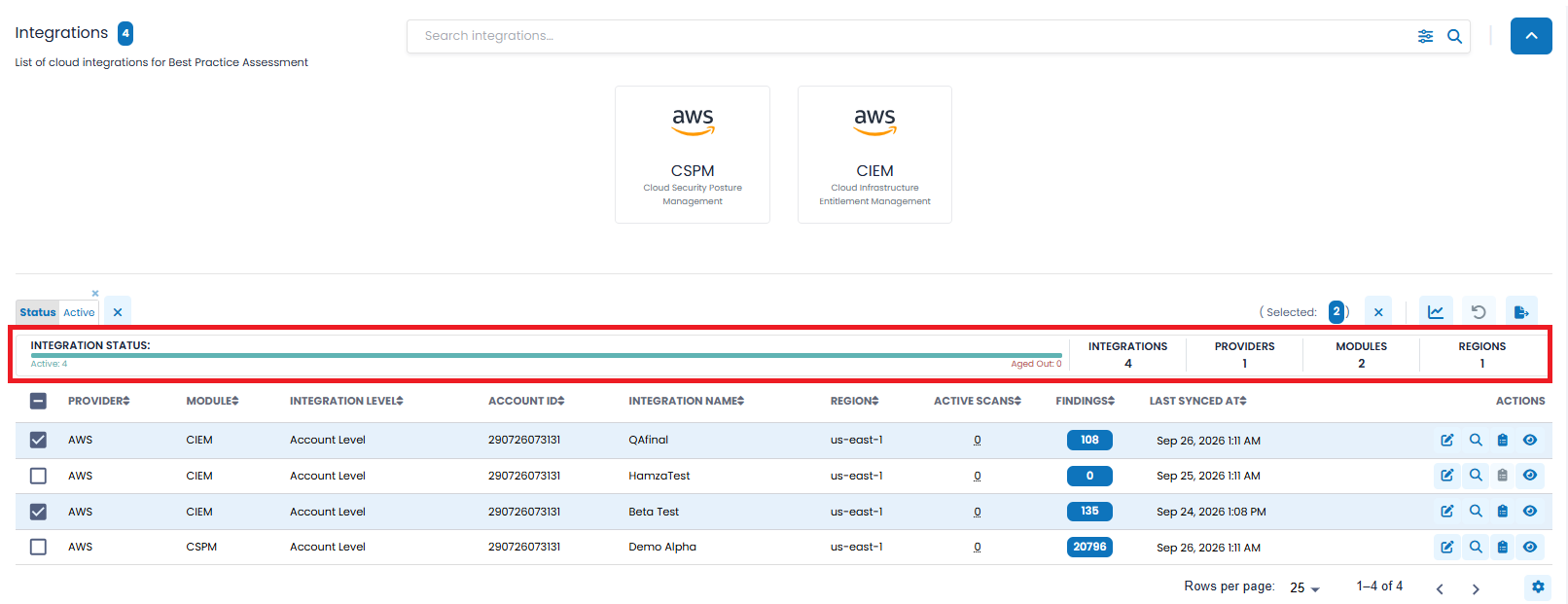
The Integrations Insights Bar provides a quick overview of the integrations represented by the current filter selections.
The bar begins with an Integration Status visual indicator showing the number of integrations that are Active or Aged Out.
To the right of the Integration Status Bar are several key numeric indicators that provide contextual scope:
- Integrations – Total number of integrations represented in the current selection.
- Providers – Number of unique Cloud Providers represented.
- Modules – Number of BPA Benchmark Modules represented, such as CSPM and CIEM.
- Regions – Number of Cloud Provider regions represented.>
These summary counts update dynamically as filters or integration selections are applied, providing a real-time overview of the integrations tailored to the user’s focus area.
The Integrations grid provides detailed information about each configured Cloud BPA integration.
Each row represents an individual cloud integration and includes the following fields by default, however, users can customize the grid to add, remove, or re-arrange fields to meet their needs by clicking the  action icon, explained here.
| Column Headers | Definition |
|---|---|
| Provider | The Cloud Provider associated with the integration, such as AWS. |
| Module | The selected module. Currently only CSPM (Cloud Security Posture Management) and CIEM (Cloud Infrastructure Entitlement Management) are supported. |
| Integration Level | Indicates whether the integration is configured at the Account Level or Organization Level. |
| Account ID | The Cloud Provider Account ID associated with the integration. |
| Integration Name | The name assigned to the cloud integration, if any. |
| Region | The Cloud Provider region associated with the integration. |
| Active Scans | The number of active BPA scans associated with the integration. |
| Findings | The number of BPA Findings associated with the integration. This is a drillable field. |
| Last Synced At | The date and time the integration was most recently synchronized with SP360. |
| Actions | Row-level action icons, explained below. |
To learn more about the optional fields that can be added, removed, or re-arranged in the Integrations grid, click here.
Each integration has four row-level action icons.
| Icons | Definition |
|---|---|

|
Clicking this icon allows you to edit the name assigned to the integration. |

|
Clicking this icon initiates a new scan for the selected integration. |

|
Clicking this icon displays the active Findings associated with the selected integration. |
|
|
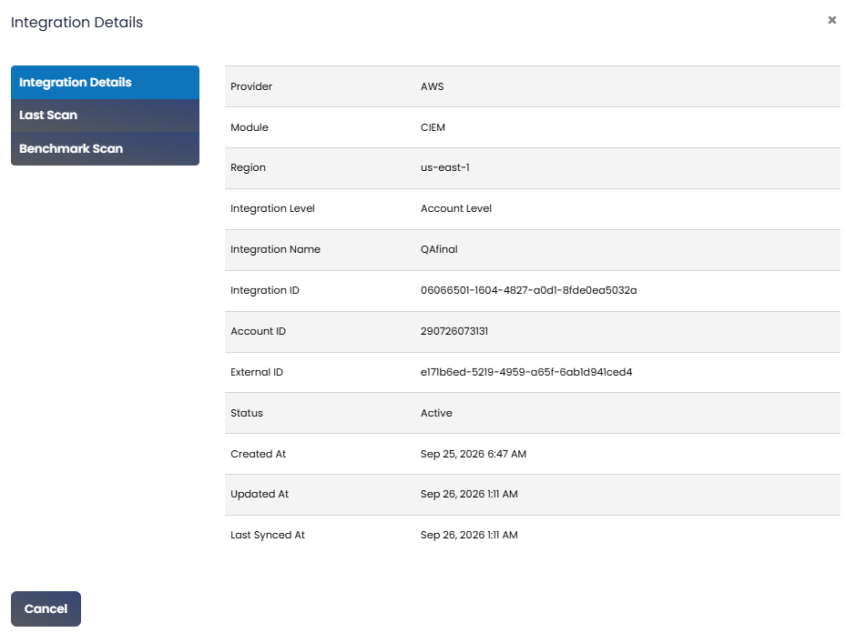
Clicking this icon displays detailed information about that integration. The details page has three tabs to organize the data into logically related groups, one of which is shown below. |