SAST Overview
The “second generation” of the SP360 Static Application Security Testing (SAST, sometimes also referred to as Static Code Analysis) Dashboard brings significant improvements and enhancements to the continuous monitoring capabilities for Vulnerability Management. It enables you to get deeper insights into different Key Performance Indicators (KPIs) for your source code contained in the connected code repositories by offering many more filters to configure your view into your vulnerability data.
Whereas all the other dashboards get their vulnerability information from Qualys, the Static Code Analysis information provided on this dashboard leverages SonarQube, which returns not only vulnerability data, but also information about Bugs discovered in your code, as well as Best Practice Violations (BPV). As such, this new dashboard enables you to focus on the vulnerabilities (as well as Bugs and BPVs) that are most important for your organization. In addition to illustrating the “current state” of vulnerabilities, it also adds significant insight into the historical “trending” so you can see the progress your organization is making in addressing any and all outstanding vulnerabilities.
Filtering Chart Content
For ease of use, the new dashboard has options/buttons at the top of the dashboard that can be used to filter the chart information. In addition, the last section of the dashboard (i.e., SAST list) allows you to include or exclude the Code Repositories that contribute to the Bug, BPV and Vulnerability data.
| Options/Buttons | Descriptions |
|---|---|
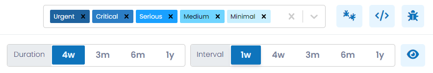
| Severity | From this drop-down you can select one or more severities of interest to alter the charts accordingly. The severity of each Bug, BPV or Vulnerability is classified as Urgent, Critical, Serious, Medium and Minimal. Hovering the cursor over the chart shows the breakdown of Bugs, BPVs and Vulnerabilities. |
| By clicking this button, you can filter (limit) the available information to only the Bugs found while performing the static code analysis. All the charts will be modified to show entries specific to Bugs. | |
| By clicking this button, you can filter (limit) the available information to BPVs. All the charts will be modified to show entries specific to BPVs. | |
| By clicking this button, you can filter (limit) all the available information to vulnerabilities. All the charts will be modified to show entries specific to vulnerabilities. | |
| Duration | Using this control, you can establish the time-period the chart covers. The available options are 4 weeks, 3 months, 6 months or 1 year. |
| Interval | Using this control, you can establish the period of time each data point represents. The available intervals are 1 week, 4 weeks, 3 months, 6 months or 1 year. The intent is to enable you to view the trending over the desired time periods; for example, month-over-month, or quarter-over-quarter. |
| To view the Bug, BPV and Vulnerability counts for each interval in all the charts you can use this toggle button, which removes the need to hover over the chart. | |
The enhanced SAST dashboard provides information for Bugs, BPVs and Vulnerabilities in three sections:
- Vulnerabilities Trending History
- Current Vulnerabilities (i.e., current counts)
- Vulnerability Metrics
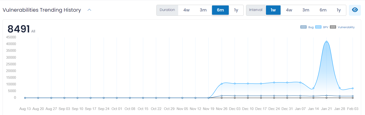
Vulnerabilities Trending History
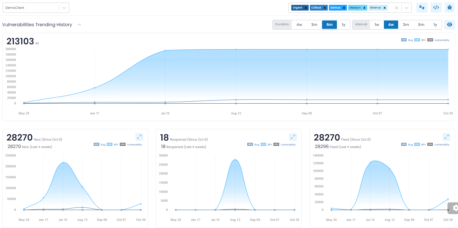
Vulnerabilities Trending History (which is a collapsible section) provides you with an overall trending of Bugs, PBV and Vulnerability counts, so that you can observe the progress made over time. The data is represented in charts (as shown above) and segmented with a separate chart for:
- Total Number of Vulnerabilities
- New Vulnerabilities
- Reopened Vulnerabilities
- Fixed Vulnerabilities
Note: In the lower four Trending Charts, you will find two annotations. The annotation displayed on top shows the number of vulnerabilities (i.e., New, Reopened, Fixed or Ignored) discovered since the completion of the last Interval chosen, so it represents a partial Interval. It grows by a day, each day.
The annotation displayed on the bottom shows the vulnerabilities discovered for the last full Interval retroactively from today, such as 1-week, 4-weeks, and so on. This is a moving interval that changes each day. When selecting a 1-week Interval, both annotations are “drillable”, allowing you to see the corresponding vulnerabilities. For Intervals other than 1-week, only the second annotation is “drillable”.
Total Number of Vulnerabilities
The trending of all existing Bugs, BPVs and Vulnerabilities (i.e., New, Reopened or Existing) and filtered according to the controls discussed above. Often organizations will be most interested in the highest severity issues and will limit the charts to only Urgent and Critical.
New Vulnerabilities
This chart provides you with insight into “new” Bugs, BPVs and Vulnerabilities, meaning those that were discovered for the first time within the chosen interval. For example, if you chose an interval of one week, the chart will show how many new Bugs, BPVs and Vulnerabilities were found for each complete week, for the entire chosen duration.
Reopened Vulnerabilities
This chart provides you with insight into “reopened” Bugs, BPVs and Vulnerabilities, meaning those that were previously remediated, but re-discovered within the chosen interval. In general, “reopened” Bugs, BPVs and Vulnerabilities should be rare.
Fixed Vulnerabilities
This chart provides you with insight into those Bugs, BPVs and Vulnerabilities that have been remediated within the chosen interval. Most organizations find this insightful and will correlate these numbers to their most recent development or IT efforts.
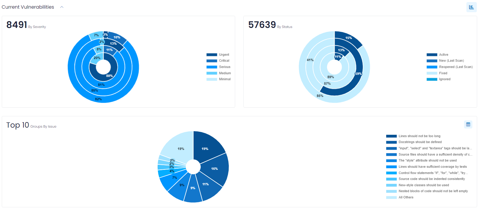
Current Vulnerabilities
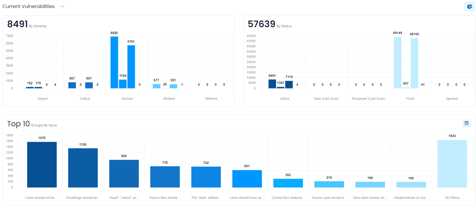
Current Vulnerabilities (which is a collapsible section) provides you with charts that show the current Bugs, BPVs and Vulnerability counts in the following categories:
- By Severity – which allows you to quickly focus on the most severe Bugs, BPVs and Vulnerabilities.
- By Status – to easily discern the current Bugs, BPVs and Vulnerabilities by their status.
- Group by Issue – a grouping chart that shows your Bugs, BPVs and Vulnerabilities in groups, to easily understand the types of each that are most common and that by addressing their underlying root cause can, enable you to address multiple vulnerabilities at a time.
For the By Severity and By Status bar charts, the counts are presented by three bars: in total, and then broken out by Bugs, BPVs and Vulnerabilities. If you opt for just one of Bugs, BPVs or Vulnerabilities, the chart is reduced to a single bar for each category.
By default, these counts are represented as bar charts. If you prefer to see the counts expressed as percentages and in a pie chart format, click the ![]() action icon to the right of the Current Vulnerabilities heading, as shown below.
action icon to the right of the Current Vulnerabilities heading, as shown below.
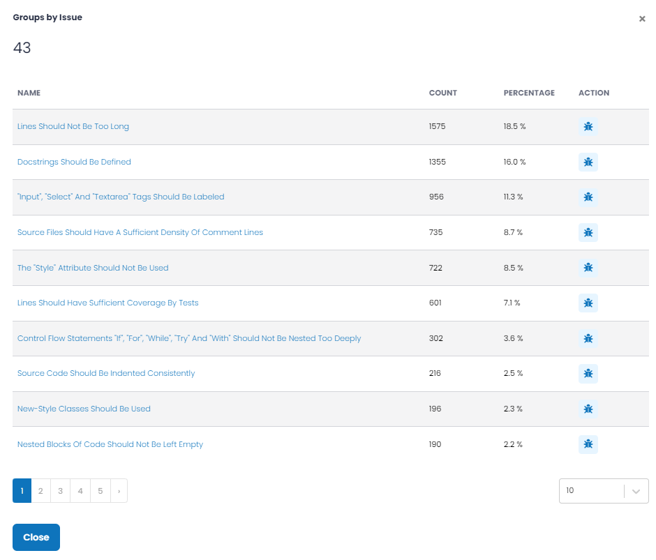
By clicking the ![]() action icon in the upper-right corner of those charts, you can view a pop-up (shown below) that lists all groups (not just the Top 10) and provides additional information. The action icon
action icon in the upper-right corner of those charts, you can view a pop-up (shown below) that lists all groups (not just the Top 10) and provides additional information. The action icon ![]() allows you to see each Bug, BPV or Vulnerability for the group.
allows you to see each Bug, BPV or Vulnerability for the group.
Vulnerability Metrics
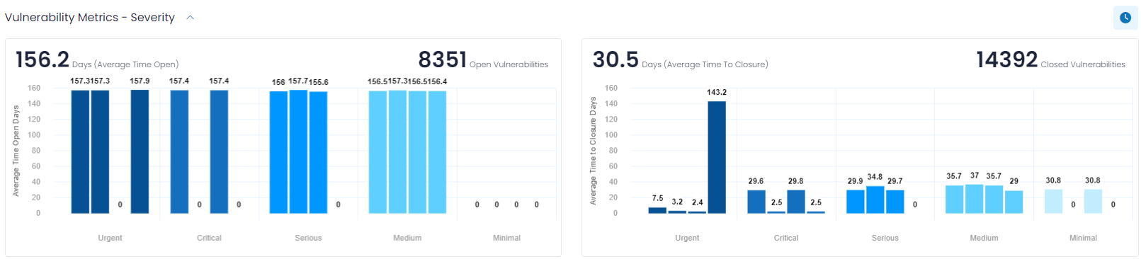
Vulnerability Metrics (which is a collapsible section and is collapsed by default) provides insights into how long your open Bugs, BPVs and Vulnerabilities have been open, and how long it took to close them. Often organizations have Service Level Agreements (SLAs) that commit them to addressing issues within a given timeframe, and this information helps you understand how well you are adhering to your SLAs.
The Bug, BPV and Vulnerability Metrics are presented in one of two formats that can be toggled by clicking the ![]() action icon on the upper-right hand portion of this section. By default, the Severity-based format is shown, which contains the following two bar charts.
action icon on the upper-right hand portion of this section. By default, the Severity-based format is shown, which contains the following two bar charts.
Days (Average Time Open)
This bar chart shows the total number of open Bugs, BPVs and Vulnerabilities (upper right notation) and the average number of days (upper left notation) that each severity of Bugs, BPVs and Vulnerabilities have been open. Hovering over the chart will also show how many Bugs, BPVs and Vulnerabilities were considered for the metric calculations.
Days (Average Time to Closure)
This bar chart shows the number of Bugs, BPVs and Vulnerabilities closed in the specified time frame (upper right notation) and the average number of days (upper left notation) the Bugs, BPVs and Vulnerabilities were open before being closed.
Clicking on the ![]() action icon to the far right of the Vulnerability Metrics header displays a “Timeband” label, and breaks down the number of Bugs, BPVs and Vulnerabilities by ranges of days, for example, those open less than three days, or between three and seven days. This data is presented in pie chart format.
action icon to the far right of the Vulnerability Metrics header displays a “Timeband” label, and breaks down the number of Bugs, BPVs and Vulnerabilities by ranges of days, for example, those open less than three days, or between three and seven days. This data is presented in pie chart format.
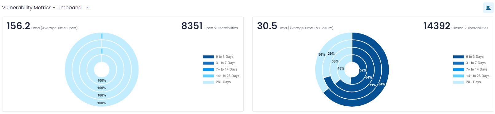
Notice that the action icon used to toggle between Severity-based and Timeband-based formats changes.
SAST (Asset) List
The last section of the dashboard lists all the source code repositories that contribute to the data. In addition, this section of the dashboard allows you to tailor the metrics being shown by including or excluding specific repositories. For example, if you know that one of your applications is being retired (i.e., taken out of service) next month and therefore you do not want the dashboard cluttered by the Bugs, BPVs and Vulnerabilities associated with the source code (repository) for that application, you can exclude that repository from the dashboard. This is accomplished by selecting the repositories of interest (which will be noted in the Selected count) and then clicking the update ![]() action icon.
action icon.
The end user can also export (in CSV format) details about all/filtered repositories by clicking the ![]() action icon.
action icon.
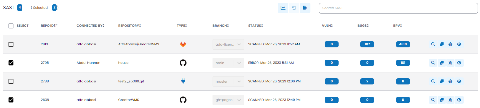
The SAST (repository) list includes the following details.
| Attributes | Definition |
|---|---|
| Repo ID | The ID of the repository, assigned by SonarQube. |
| Connected By | The name of the user that originally connected the repository. |
| Repository | The name of the repository. |
| Type | The type of repository (i.e.,AzureDevOps, Bitbucket, GitHub or GitLab, etc.) |
| Branch | The name of specific branch being scanned. A branch much always be provided. |
| Status | The current status of the repository. Typically, this shows the last time the repository was scanned. |
| VULN | The number of vulnerabilities found in the source code being scanned. |
| BUGS | The number of bugs found in the source code being scanned. |
| BPV | The number of BPVs found in the source code being scanned. |
The action icons to the right of each repository ![]() allow you to do the following:
allow you to do the following:
The ![]() action icon is used to invoke a manual scan. This action requires a confirmation because the scan can be time consuming depending on the size of the repository.
action icon is used to invoke a manual scan. This action requires a confirmation because the scan can be time consuming depending on the size of the repository.
The ![]() action icon is used to clone the repository. Since each branch to be scanned requires its own entry, if there are multiple branches to be scanned within the same repository, the user will connect to and configure the first, then clone that configuration and simply change the branch to be scanned.
action icon is used to clone the repository. Since each branch to be scanned requires its own entry, if there are multiple branches to be scanned within the same repository, the user will connect to and configure the first, then clone that configuration and simply change the branch to be scanned.
The ![]() action icon is used to display all vulnerabilities associated with that repository. For more information about the vulnerabilities page, click here
action icon is used to display all vulnerabilities associated with that repository. For more information about the vulnerabilities page, click here
The ![]() action icon displays detailed information about the repository, as shown below:
action icon displays detailed information about the repository, as shown below:
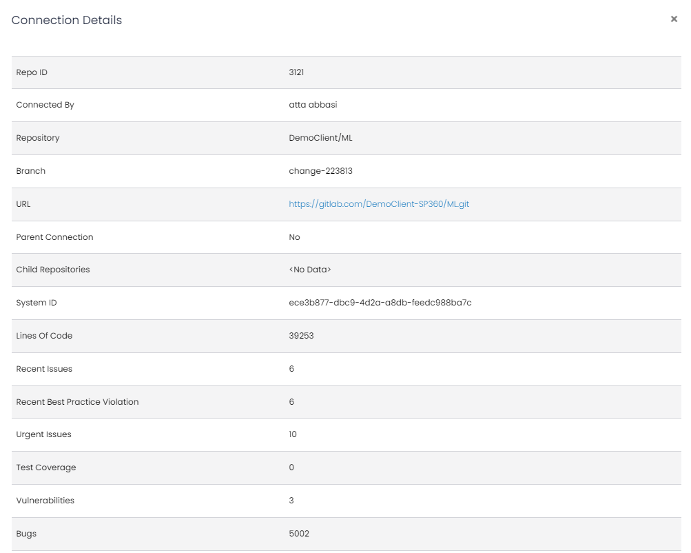
At the bottom right of the Details page is a button ![]() that allows you to deactivate the SAST, which will stop the scanning of the repository, until it is re-activated.
that allows you to deactivate the SAST, which will stop the scanning of the repository, until it is re-activated.